User Interface
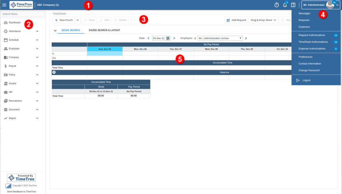
After you sign in to TimeTrex you will see the main user interface, which is similar to the following image:

There are five primary areas:

|
Header Bar - The dark colored bar across the top of the screen. The left side of the header bar contains the main menu button, company logo and company name. The right side of the header bar contains buttons for Punching In/Out
|

|
Main Menu – Located on the left side of the screen. Click any item in the menu to navigate to that section or click on the up/down arrows to open or close sections of the menu. Click on the menu icon, |

|
Button Bar - Below the Header Bar, Button bars or sub-button bars may be available across the top of main pages, inset pages and tabs. Click on these buttons to perform specific actions, for example, View, Edit, Save. Some buttons include a down arrow on the right side to access other related options. For example the "Save" button down arrow expands to show "Save & Continue", "Save & Next", "Save & Copy" and "Save & New". If an action button is not enabled on a particular page it appears grey.
|

|
Employee Profile Menu - Accessed by clicking the down arrow at the top right of the screen near
|

|
Listing/Details – This section contains a listing or set of fields that corresponds to the selections made from the menu or buttons.
|
 , Notifications
  and accessing the Help Menu
  and the
  on the left side of the header bar to switch between the Default, Slim and Horizontal menu modes.