Drop-Down Boxes
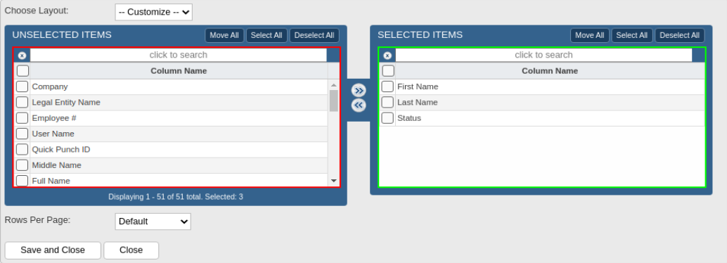
To easily select multiple items, two-panel drop-down boxes are used, such as the one in the example below.

The Unselected Items panel on the left, outlined in red, shows a list of all the available options or fields to choose from. These items are not yet selected for use. The Selected Items panel on the right, outlined in green, lists the items that are actively in use.
You can easily move items from one panel to the other.
-
To move an item from the Unselected Items panel to the Selected Items panel, click on an item in the left panel and then click the right arrow icon
 located in the middle of the two panels. The item will then move from the left panel to the right panel. For efficiency, you can drag-and-drop one or more items from the one panel into the other panel or double-click on the item and it will move to the other panel.
To select multiple items at a time, use one of these convenient methods:
-
Click on the Select All or Deselect All button and then the Move All button at the top of the panel.
-
To include multiple nonadjacent items, press and hold the CTRL key.
-
To include a range of items, press and hold the SHIFT key, then click the first and last item in the range.
To remove an item, select it from the right panel and then click the left arrow icon ![]() , or drag-and-drop the item into the left panel.
, or drag-and-drop the item into the left panel.
Similar to other search boxes, you can quickly find an item in either in the Unselected or Selected Items list by clicking in the "click to search" box near the top of each panel and typing the name of the item you want to search for.
Customizing Drop-Down Boxes
The columns can be customized for specific drop-down boxes if the edit column icon is displayed in the top-left corner of the drop-down box. The edit column icon (depicted as a down arrow and three vertical columns) is encircled in red and indicated by a red arrow in the image below.
To customize a drop-down box:
-
Click on the edit column icon in the top-left corner of the drop-down box.
-
Select the column names or fields you want included in the drop-down box using the same methods described above to move fields into or out of the Selected Items box.
Example of a customizable drop-down box:

-
To rearrange the order of the Selected Items, click on an item and drag-and-drop it up or down the list.
-
To restrict the number of rows that will appear on each page when the drop-down listing appears, choose a value from the Rows Per Page drop-down.
-
Save your changes by clicking on the Save and Close button, or click Close to discard your changes.